The best dashboards are informative, clear, and beautiful. You can make operational decisions by quickly glancing at them, or at most performing some light analysis. Stephen Few, a leading information technology teacher and consultant who focuses on best practices for creating visualizations of business data, has said that dashboards must be designed to support real-time situation awareness by expressing performance measures clearly, precisely, and without distraction. Put differently, they must grab your attention when necessary, make it easy to identify what's most important in the screen, and provide the ability to understand what's happening and respond immediately. For dashboards to do this, they need expert visual design.
Here are some best practices for making dashboards:
- Determine your audience and why it needs a dashboard—A good first step is to determine who the audience of your dashboard is, and which questions they need to answer by using your dashboard. The answers to these questions should inform every design decision you make. This information is especially useful when deciding which information is relevant and should be included in the dashboard. When possible, it's best to make a dashboard for one audience, so you can tailor the dashboard to that audience's requirements. One dashboard with information that's relevant to some users but not all isn't as useful as two dashboards that only contain pertinent information for each audience.
- Omit irrelevant information—Only include information that users need to know. Additionally, information that's relevant but not essential is distracting and decreases the dashboard's usability.
- Keep it simple—Resist the urge to add unnecessary visual elements and media to your dashboard. Keep the number of visual elements in a dashboard to seven or fewer. The main objective of a dashboard is to present information clearly, and unnecessary visualizations clutter dashboards. Keeping dashboards simple will also ensure smooth performance.
- Provide context—Stand-alone numbers are often not very useful for
understanding your operational
status. Contextual information, such as target or historical
values, makes current values more meaningful and helps users decide
whether a situation warrants attention. Context can also assist
users in identifying concerning trends, which can lead to actions
that prevent problems (Few 2017).
You can provide context in your dashboard by setting reference
values in indicators, including
guides in serial charts, or using charts that are more appropriate for showing time-series data, such as line or area charts.

- Choose the right chart—Various chart types and styles are supported. Using the appropriate chart for your data will help make clear what you want to show to users.
- Notify users of important events—Increase your organization's responsiveness by configuring the dashboard so that
users are immediately notified when something occurs that requires action. Ideally, include no
more than two notifications in a dashboard to avoid flooding users
with noncritical notifications (Few 2017). You can draw attention to updates in a dashboard by using
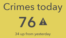
conditional formatting. This causes an
element's appearance to change based on your data. The indicator is one of the elements that supports conditional formatting. For example, you can
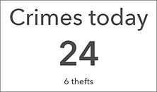
configure it to turn yellow and include an exclamation point when the number of
crimes has increased by more than 20 compared to yesterday, and appear with a white background the rest of the time, so that you can easily tell whether or not the number of crimes has significantly increased.

- Arrange and size elements appropriately—Organize and size elements based on their importance and relationships with each other. The elements with the most important information should be the largest and have the most prominent locations in the dashboard (Few 2017). Place the most essential elements in the upper left corner of your dashboard, and the least essential in the lower right, since most people read from upper left to lower right. Also, group highly related elements so that they always appear next to each other and it's easier to see their close relationship. The map and map legend elements, as well as the list and details elements, are commonly grouped together.
- Use color wisely—A common design problem with dashboards is that they have too much color. This can make them visually overwhelming and difficult to read. Only use color to display data differences, and when other methods to do so aren't as effective. When you do use color, take advantage of the default color sets available in certain elements, such as serial and pie charts. The colors in these sets are designed to look good together. Another common problem is the use of red and green, which look the same to people with color blindness (Few 2017).
- Consider where the dashboard will be used—Think about the environment in which the dashboard will be used when designing it. If the dashboard will be used in a dimly lit office, consider using the dark theme to make it pop more. If the dashboard is going to be displayed on a monitor wall, as opposed to a desktop machine, it should be easy to read from a distance. Also, you should author a dashboard to look good at the screen resolution and zoom levels at which it will be displayed. In general, it's recommended to test your dashboard in the workspace it will be used in before sharing it with users.
To get started authoring your own dashboard, see Create a dashboard.
Sources:
Few, S. 2007. "Dashboard Design for Real-Time Situation Awareness." Perceptual Edge. Accessed August 1, 2017. http://www.perceptualedge.com/articles/Whitepapers/Dashboard_Design.pdf.